
Choosing the right ‘FONTS’ for your website.
Picking the right font for your online store or website is one of the most important factors for a streamlined, easy to view online experience.
Traditionally fonts were focused on for use in print material and as we went into the online world a few decades ago we have seen the rise of the non serif font. Its clean, clear and has less strokes and lines in a small space making it easy to read on digital devices.
There is much discussion around using serif and non serif fonts in the online landscape, and while a decent striking serif font can make a great header or sub header, it tends to be difficult to read as a font typeface used in the digital online forum.
Funnily enough many of our clients have not even thought about fonts as they walked into their introduction to the online landscape, and others made it clear that they had a very clear font in mind, usually something they had seen before and liked. Sometimes we have made suggestions on font changes within a site we inherited for a major update and that small change turned out to be a significant one that really changed the feel of their website moving forward.
Serif Font Example : Times
Non Serif Font Example : Avenir
As you can see a serif font has all kinds of extra lines and strokes that make it a little more decorative and full of character. The non serif font has clean edges, usually rounded vowel characters and easy to read spacing of each letter perfect for dense online lettering and paragraphs.
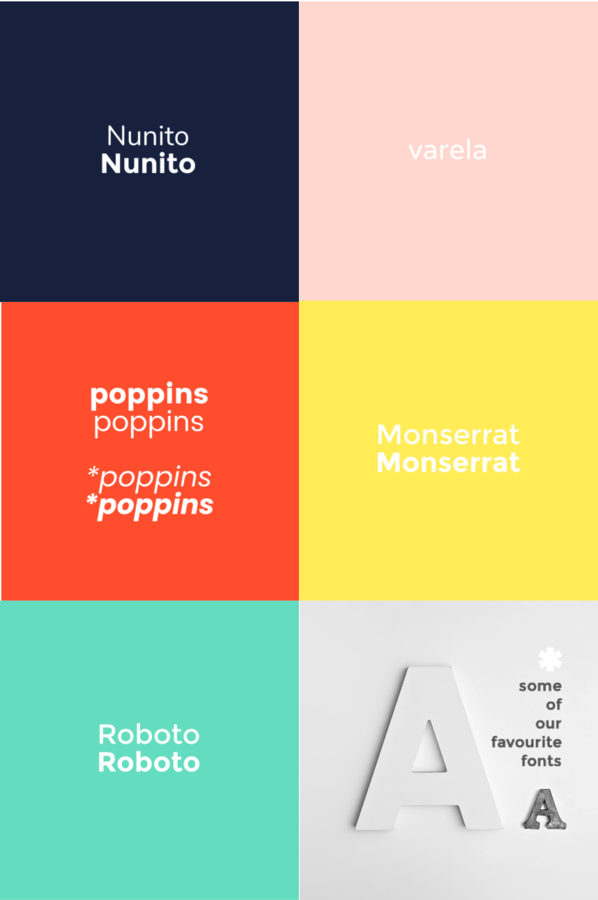
Here are our current TOP 5 Non Serif Fonts for web use.