
Colour or not to colour on websites
Here at BRINGiT Digital we have a very colourful view on things, our branding lends itself to colour vividly and we believe that for us to show our clients versatility, colour is a wonderful way to showcase imagery and important information. But interestingly we have a secret love of the monotone website. Over the years we have worked with tech clients and serviced based clients wanting a sophisticated and clean look, where information is key and the story of the business is told mainly with words and graphs, or very simple yet striking black + white imagery. There are so many ways to make Black + White the ‘colour story’ of your online presence.
One of the topics that arises with our first point of contact with new clients or existing clients wanting a rehaul, is the style guide in mind and usually that style guide will dictate where a lot of the website goes creatively and visually. Often colour content is set by an industry standard, other times its very much connected to the clients core branding. For example an online store selling kids clothes and toys will usually be showcasing colourful products, so in this case the images are the key colour component. Keeping the main frame of the website neutral or choosing one key colour can help frame the multitude of colours and sell the products, having too much colour can also confuse things and overstimulate.
Colour is often personal, and some will say a colour can make or break a visual experience.
Much has been debated over the years when it comes to the ‘symbolism’ of colour, red can mean passion and fire, blue is connected with being trustworthy, green invokes a sense of freshness and life, yellow a sense of light and happiness, pink is warm and creates a mood of ease and love particularly if pale pink and the list goes on. Everyone has a different relationship with colour and its finding that middle ground to try and please ‘most’ that can be the trick to colour in the online world.
From our perspective we encourage clients to think deeply about their colour choices, how it effects their branding, or will it create a sub branding well in their online space. For those wanting to create a very specific experience colour can literally make it or break it.
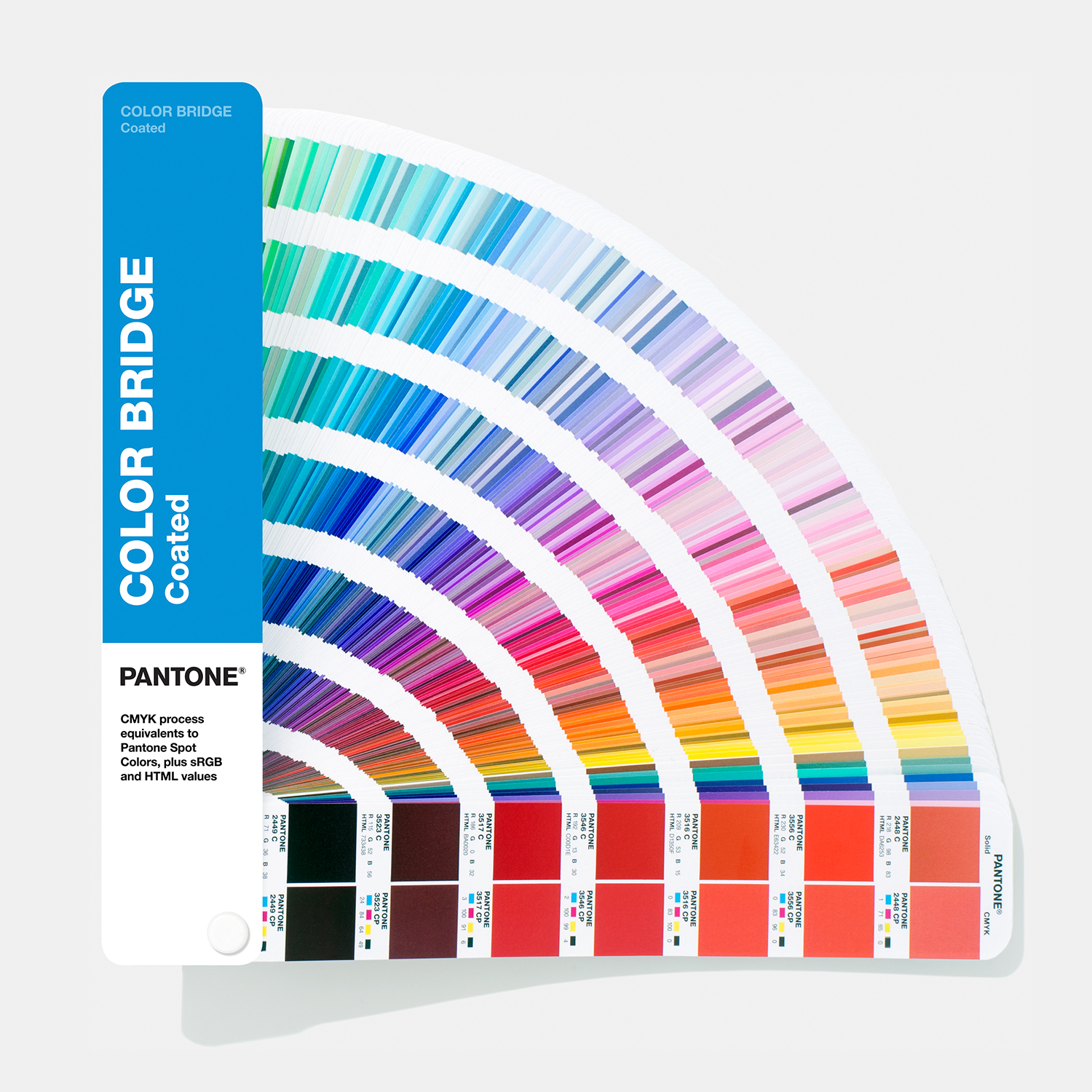
Colour Tip : we use a ™PANTONE® book called COLOR BRIDGE®
This pantone guide is great at matching your print collateral (usually in CMYK) to its RGB (onscreen) counterpart. Its been an easy way to find screen colours quickly for style guide matching.